Any Question
+91 97663 97512
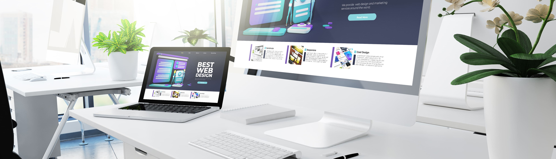
Over 60% of web traffic now comes from mobile devices. If your site isn't easy to use on a smartphone, you're losing customers to your competitors. At IT Planet, we specialize in mobile responsive website design in Mumbai, creating fluid layouts that look and function perfectly on smartphones, tablets, laptops, and desktops.
We use a mobile-first approach to ensure your content is prioritized for small screens without sacrificing the professional look of the desktop version. By using flexible grids and modern CSS, we eliminate the need for zooming or horizontal scrolling.

We build websites that adapt to your users, no matter where they are or what device they are using.
Using percentage-based layouts rather than fixed pixels so your website stretches and shrinks smoothly based on the screen size.
Buttons and menus are designed for fingers, not just cursors, ensuring easy clicking and browsing on mobile touchscreens.
Text sizes and line heights are automatically adjusted for maximum readability on small screens without the need for manual resizing.
We test your site on iOS, Android, Safari, and Chrome to ensure consistent performance across all platforms.
Google favors responsive sites in search rankings, giving you a competitive edge in Mumbai's local search.
Instead of building a separate mobile app or site, one responsive website covers all your bases.
Connect with Mumbai’s experts to turn your site into a device-friendly powerhouse.
Free Responsive Audit: +91 97663 97512Launch Your Digital Presence with 20% OFF on all Tech & Marketing Services this month!